How to Design Eye-catching Corrugated Cardboard POP Displays
Corrugated cardboard POP displays boost visibility and impulse sales when built with a clear brief, bold focal point, simple messaging, strong structure, and easy assembly. Includes a 10-step pre-production checklist.
Back to blogs
Corrugated cardboard point of purchase (POP) displays are one of the most effective in-store tools for boosting visibility and driving impulse purchases. When a well-designed display is placed in high-traffic areas like checkout zones, endcaps, or main aisles, it can cut through shelf clutter, draw shoppers’ attention to promoted products, and guide them from interest to purchase.
Cardboard is especially well-suited for retail promotions because it is cost-effective, easy to refresh for short campaigns and seasonal themes, highly printable, and ideal for flat-pack shipping and fast rollouts. After the campaign, it can enter established paper recycling streams. More importantly, POP displays serve as both marketing assets and in-store execution tools. They require not only attractive visuals but also safe load-bearing capacity, quick assembly, and the ability to stay neat after frequent shopper touch and product removal.
If you’re still figuring out how to make your cardboard displays more appealing, the principles below can serve as a practical guide. These guidelines apply to most fast-moving consumer goods, cosmetics, pharmacy products, convenience store goods, and light consumer electronics accessories, while also functioning as a quick pre-production checklist.
1) Start With a Clear Brief
Before starting the design, clarify four key elements. Treat the design brief as the goal definition and execution boundaries.
- Objective: New product launch, price promotion, bundle offers, trial promotion, or clearance sale
- Featured SKUs: Build the display around core products or featured bundles
- Retail Environment: Supermarkets, convenience stores, pharmacies, warehouse membership stores, cosmetic retailers, electronics stores, etc.
- Store environment: Supermarket, convenience store, pharmacy, warehouse club, beauty retail, electronics, and so on
- Display Position & Space: End caps, checkout areas, entrance zones, or beside main shelves
When you try to achieve too many goals at once it often leads to information overload and conversion drops. A strict brief prevents clutter from the start, ensuring consistency in subsequent visual design and structural decisions.
2) Prioritize Long-distance Visibility
In-store attention is short. Whether shoppers notice you at first glance determines everything that follows.
Capture the first glance with eye-level top banners
Ensure banner dimensions remain clearly legible from several meters away. Brand identity and core messages must be instantly recognizable, enabling customers to grasp promotions without approaching.
Create one visual focal point
Pick one “main character.” Either the flagship product or the core message, and avoid competing for attention at the same time. The clearer the layout, the faster shoppers grasp your message.
Use contrast to boost visibility
High contrast usually improves readability from a distance. If packaging is colorful, keep backgrounds simple. If packaging is simple, use stronger visual elements to add energy, but ensure the core message remains the most prominent.
3) Keep Messages Concise and Shopper-friendly
Many POP displays underperform for one simple reason: they try to communicate too much.
Rules for physical stores
- Keep one primary message, ideally a single short line
- Add one supporting message at most, such as a key benefit or a promotion point
- Avoid long paragraphs. Most shoppers will not stop to read them
Typography and white space
Use clear, legible fonts and maintain ample spacing. White space doesn't waste space. It enhances readability and remains a key element in achieving a simplified, premium display.
4) Make the Display Feel “Easy to Buy From”
A common situation is that a display looks perfect on day one, then starts to get messy by day three. If you want the display to stay neat throughout the campaign, designs must account for practical operations: product pickup, restocking, and daily maintenance.
Key display layout principles
Use tidy rows and consistent facings so the display still looks full even after some items sell through.
- Avoid mixing excessive product specifications and packaging formats unless intentionally creating a thematic narrative
- Keep the top visual area clean and the product area structured
Shopper reach and restocking efficiency
- Place bestsellers at the most accessible grab height
- On taller displays, keep heavier products on lower tiers
- Set up restocking access points or optimize restocking paths to reduce store labor costs
Price clarity
Clear pricing and promotional information can directly drive purchases. It must be placed within the shopper's natural standing eye level and should not visually conflict with primary promotional messages.
5) Select Material Based on Load and Printing Requirements
Corrugated board selection should be based on product weight, shelf span, and activity cycle.
Common material selection logic
- E Flute: Smoother surface for sharper printing, suitable for light loads
- B Flute: Versatile heavy-duty option for most medium-load floor and counter displays
- Double-layer combinations like EB or BC: Ideal for heavy products, tall structures, or long-term promotions, especially when rigidity and stability are required
Consideration should also be given to the liner and surface finish. White liner typically delivers more vivid colors. Using recycled fibers can enhance the product's sustainability appeal. For high-contact areas, prioritize abrasion resistance to prevent premature wear marks on display units. For special requirements such as food contact, low-odor, or specific eco-friendly ink coatings, clarify material and process standards before sampling.
6) Prioritize Structural Stability Over Visual Design Alone
Even the most attractive display stand will be quickly removed if it wobbles or seems unsafe.
Stability basics
- Reinforce the base and keep the center of gravity low
- Put heavier products on lower shelves
- Add internal supports when shelf spans are wide or loads are high
- Do not oversize top beams unless the structure can support it
Shelf load capacity
The longer the shelf span, the higher the potential for sagging. Reduce the span or add supports. Use real products for testing, not estimated values.
7) Fast Assembly Is Key to Store Execution
Store execution makes or breaks the program. If assembly is slow, complicated, or unclear, the display may never make it to the sales floor.
Stores typically prefer:
- Snap-fit and slot-in designs for tool-free assembly
- Minimizing steps and loose parts
- Providing clear instructions, ideally with simple diagrams
The ideal scenario is for displays to assemble quickly, lock securely, and be immediately ready for placement.
8) Design for Logistics, Storage, and Rollout Speed
A great design loses impact if it arrives damaged or scuffed.
Packaging and logistics essentials
- Use flat-pack shipping to reduce volume and freight costs
- Protect corners and edges to prevent crushing and impact damage
- Secure parts inside the main carton to avoid rubbing that can scratch printed surfaces
If the displays are shipped with the products, ensure the structure aligns with packaging logic. Many high-efficiency rollouts adopt the shipping container concept where one shipping carton can be directly converted into a retail-ready display unit upon arrival.
9) Do Not Ignore Maintenance and Performance Review
Even the best display needs basic maintenance to stay “worth buying from.”
In-store maintenance
- Keep the display clean and well-stocked. Large empty areas will reduce trust quickly
- For longer campaigns, refresh graphics with seasonal themes to extend the display’s effective life
Performance evaluation
- Compare sales and rate of sale before and after ad placement
- Use simple photos to check ad placement setup and display condition
- If performance falls below expectations, primary variables to adjust are typically the ad copy, layout position, and clarity of prices and promotion
Quick Design Checklist (10 Items Before Mass Production)
- One clear objective and one Featured SKU
- Header near eye level and visible from a distance
- One focal point and a clean layout
- Primary message readable in one short line
- Price or offer clearly visible
- Easy shopper reach and easy restocking
- Heavy products kept low for stability
- Material grade matches weight and shelf span
- Tool free assembly with minimal steps
- Flat packed with corner and edge protection
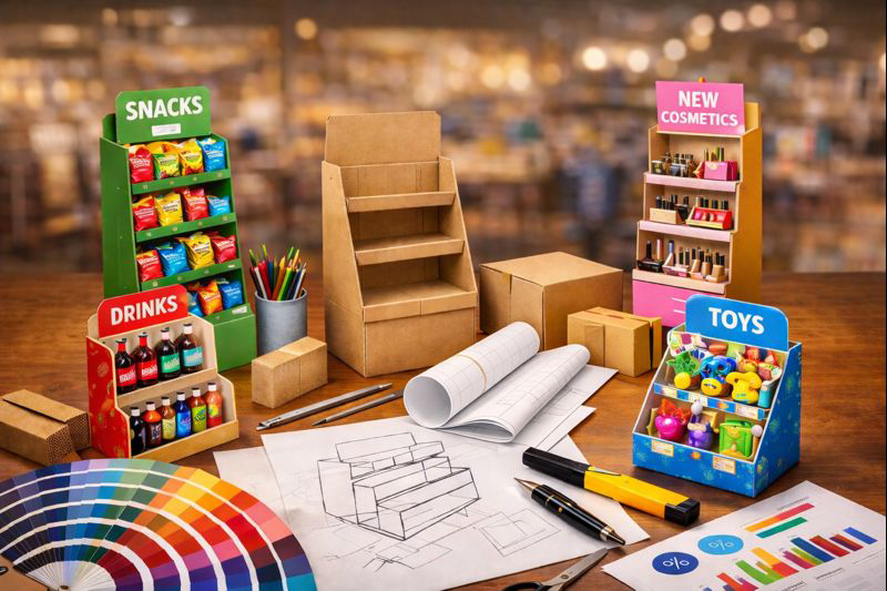
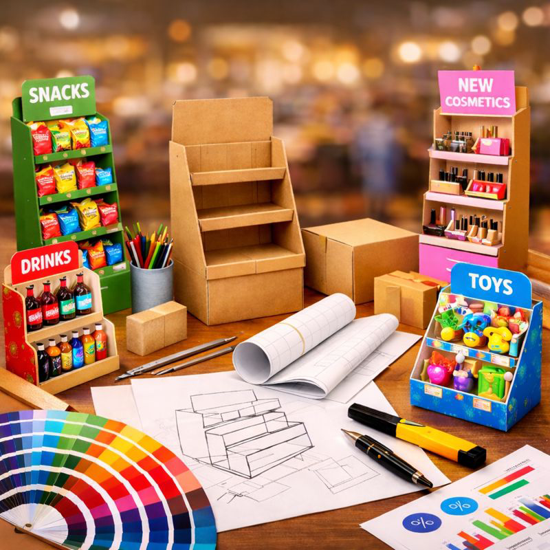
Eye-catching corrugated cardboard POP display stands designed for high-traffic retail zones, combining bold branding, clean messaging, and stable, easy-to-shop shelf layouts.
Latest Posts
All Posts


.png)
.png)